Project Summary
The Sea Level Rise Migration Project, created by students at Oregon State University, is a geovisualization of predicted U.S. migration due to sea level rise (SLR). The project is based on migration predictions for the year 2100 and 1.8m of SLR.
Background
Recent projections show that sea level rise (SLR) could displace millions of Americans by the year 2100. Using recently published projections, our geovisualization aims to show where these Americans will relocate, and how this could alter the U.S. population landscape.
A 2016 study by Dr. Mathew Hauer, at the University of Georgia, showed that 1.8 meters of sea level rise could displace an estimated 13.1 million people by 2100, living in 319 counties along the American coastline [1]. This study improved on previous estimates by accounting for population growth trends in America. However, the question remained, “Where will SLR-affected migrants go, and how will this effect the rest of the country?”
To answer this question, Hauer (2017) integrated his 2016 findings with a migration systems analysis to estimate where SLR-displaced migrants would move, on a county-to-county scale, and how their migration could dramatically alter the American population distribution.
This projection also accounted for advancements in SLR-adaptation technology. Adaptive measures will likely allow communities to mitigate the impacts of sea level rise in the future, but these adaptations will be expensive. Since only relatively wealthy communities will be able to adapt, and community wealth is well represented by individual wealth, Hauer (2017) excluded households making more than $100,000/year from his projection.
Our geovisualization presents the aforementioned findings in an interactive, geospatial setting. The hexagonal nodes are regions containing one or more counties, and the arcs represent outward migration from these regions. By interacting with our migration map, people can see how SLR-induced migration could affect both inland and coastal communities. We hope this project will encourage users to think about the challenges communities will face in the future due to climate change, and how we can all work to create a more resilient future for Americans, and for everyone, in a post-SLR world.
Methodology and Data
Our SLR-migration data, which contains county-to-county migration data within the U.S., was obtained from Hauer (2017). A shape file of United States counties was obtained from www.census.gov/geo/maps-data/data. To improve the aesthetics and functionality of this geovisualization, our map displays migration data as flows between hexagonal regions, containing one or more individual counties.
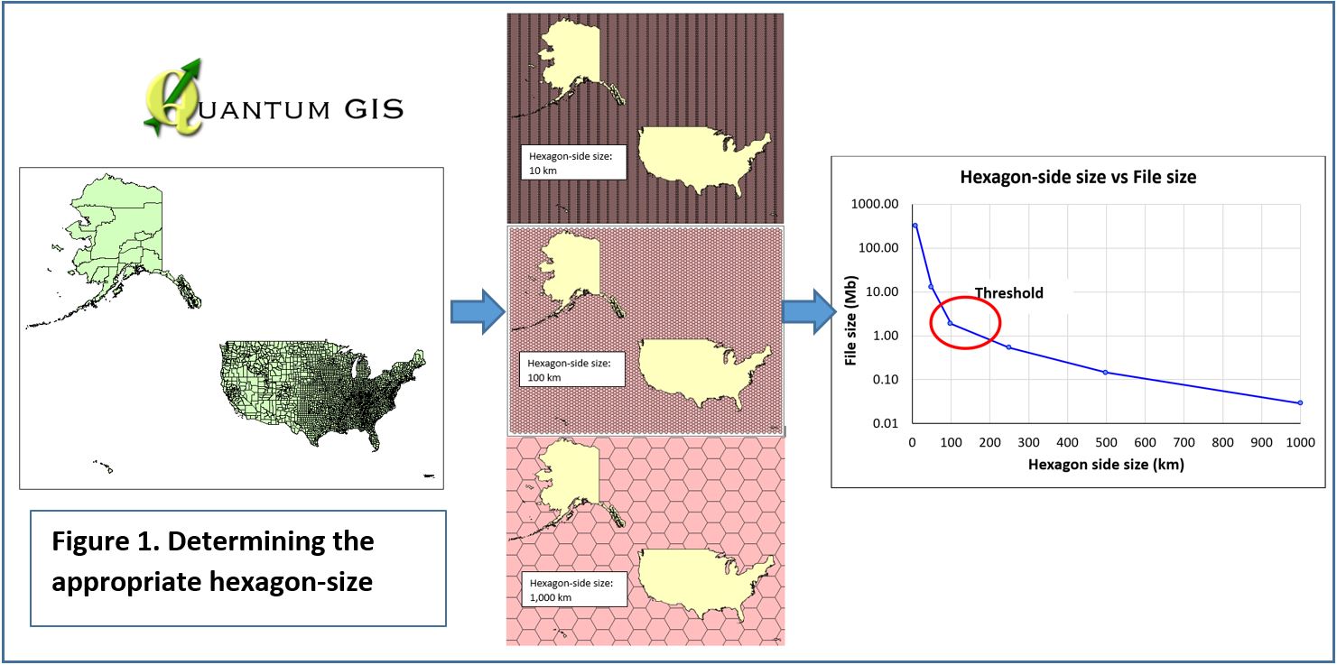
The first step in creating these regions was to set hexagon gridlines along the US map. These were prepared in QGIS by using the “hex grid from layer bounds” tool. After generating several maps with different hexagon-side sizes (HSS), a threshold was obtained in HSS equal to 100 km (Figure 1), which was selected for the next step.
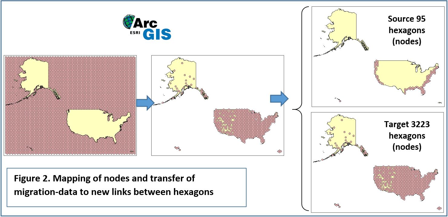
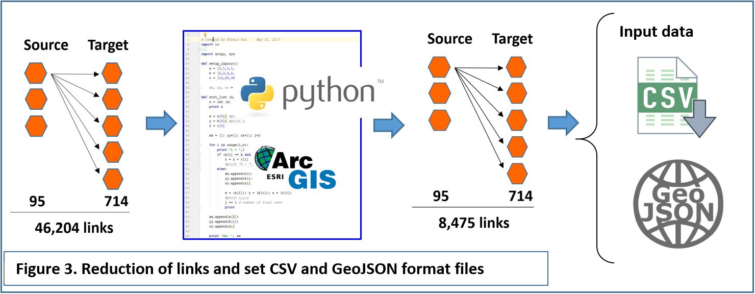
Migration flow information was transferred to the hexagons using ArcMap tools. In counties with large areas, such as San Bernardino, CA or Yukon-Koyukuk, AK, migration flow information was assigned only to one hexagon, while in small counties, one hexagon represented certain number of counties. By other hand, since the purpose of this project is to show a map of migration from areas affected by sea level rise to other areas, source counties represented now by hexagons were reduced to only coastal hexagons. This resulted in 3223 counties being represented by 714 hexagons, with unique magnitudes of migration between each of them. From them, 95 hexagons considered as sources, 714 targets, and still 46,204 links. However, since some hexagons covered more than one county, some flows had the same hexagon-origin and hexagon-target (Figure 2).
Given the large amount of information this yielded, a manual work with shapefiles even in ArcMap results in a tedious labor. Hence, two python script were developed to further process the data. This script identifies links with same source and target to merge flow (migration)values. This script also hid hexagons with zero migratory-flow to delete them. Finally, the process resulted in a clean and concise map with only 8475 links. This map was converted into GeoJSON format and its atributes into CSV format (Figure 3).
Tutorial
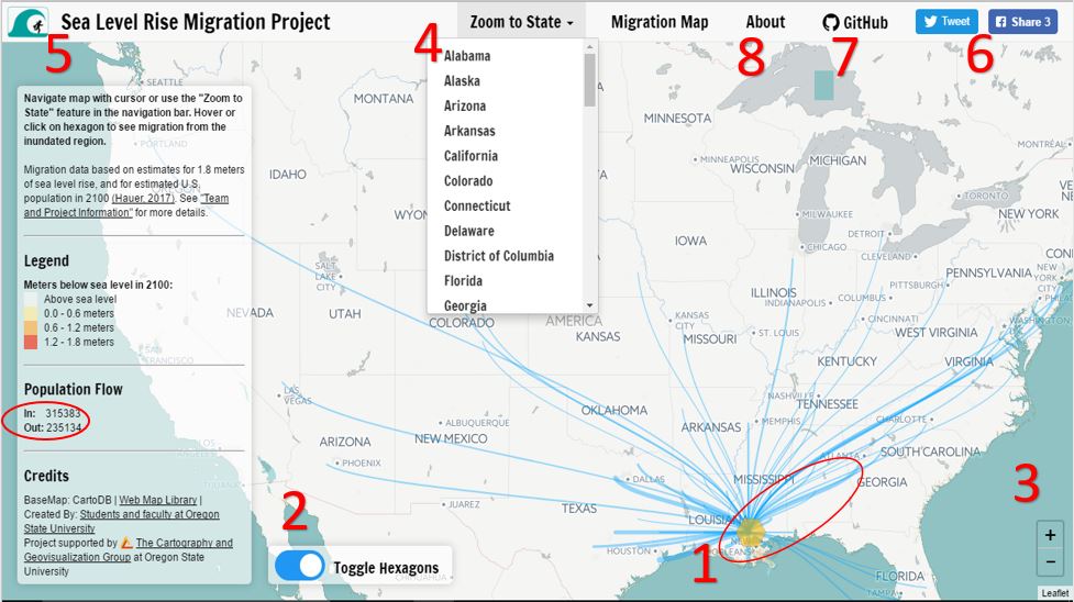
1) Hover or click on the hexagons to show arcs of county to county outflows. Outflows can be seen in the circle within the sidebar The hexagons and arcs are displayed on the map as seen circled on the map
2) Click the toggle switch to turn the hexagon nodes on or off. Turning them off allows for a closer look at coastal inundation from sea level rise.
3) Use the zoom control to zoom in or out of the map.
4) To look a at a specific state's coastal inundation or migration, select a state from the drop down menu.
5) Reset the map by clicking the Sea Level Rise Migration Project logo, or click the "Migration Map" tab.
6) To share this geovisualzation, click on the Twitter or Facebook button.
7) The code for this project can be found on Github by clicking on the link. This will take you the repository hosting this site.
8) To learn more about this project, click on the "About" tab.
Our Team

Nick Mathews
M.S. - Geotechnical Engineering
Email: mathewsn@oregonstate.edu

Efrain Noa-Yarasca
PhD - Water Resources
Email: noayarae@oregonstate.edu

Riley Johnson
B.S. - Geography & Geospatial Science
Email: johnsori@oregonstate.edu

Hoda Tahami
PhD - Geomatics
Email: tahamih@oregonstate.edu

Dr. Bo Zhao
Faculty Advisor
Email: zhao2@oregonstate.edu